Transcript
BROOKE GLADSTONE:
The typeface chosen for a logo can define a brand, just like a Coca-Cola or Fed-Ex or Google. But what about the brands known as Clinton, Obama and McCain? How much attention do their campaigns give to the marketing muscle of the humble font? And with the rise of the Web as a campaign tool, should they be giving more?
Sam Berlow, general manager of Boston-based design firm The Font Bureau, which has developed typefaces for companies including Apple Computer and The New York Times, analyzed the candidates’ logos for The Boston Globe. Welcome to the show, Sam.
SAM BERLOW:
Hello, Brooke.
BROOKE GLADSTONE:
When we talk about logos, we often talk about serif and sans serif fonts. What are those?
SAM BERLOW:
A serif font has little feet at the end of the vertical characters whereas a sans serif is something you'd see like in the Best Buy logo, big, strong, bold. There’s less contrast between the thick and the thin strokes of the letters.
BROOKE GLADSTONE:
Do you think that typefaces really say anything about the candidates?
SAM BERLOW:
I think they say quite a bit. If you look at Bush/Quayle, Quayle is the very, very thin, spindly serif typeface and the Bush is a very strong sans serif and it’s set really big. I think that said a lot about that campaign.
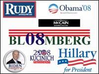
The Bush/Cheney was great. It just had that incredible NASCAR feel with the slanted sans serif saying, "We're going really fast. Hang on." [BROOKE LAUGHS] If you look at Hillary’s campaign, it’s really a throwback to Reagan and Bush. It has that feeling of old typography from the '70s and '80s. It’s serif. It’s sort of highwaisted, as if the lower case, the pants had been pulled up too high. It feels sort of like a bad Talbots suit. [BROOKE LAUGHS] Doesn't quite fit right.
BROOKE GLADSTONE:
What is the typeface that Hillary uses?
SAM BERLOW:
Oh, geez! The typophiles will talk about this for months on the blogs. I believe that it’s a Baskerville, but it looks like the lower-case R has sort of been punched in the nose and the lower case has been jacked up a little bit to make it feel a little bit bigger and stronger.
BROOKE GLADSTONE:
If you liken Hillary’s typeface to a Talbots suit, what sort of suit do you think it ought to be wearing and which font will get you there?
SAM BERLOW:
Well, I think something more like The Wall Street Journal fonts. That typeface is called Escrow. It was done especially for The Wall Street Journal. It’s very classy and very clean. It has much more contrast between the thick and the thin strokes.
BROOKE GLADSTONE:
What kind of a suit?
SAM BERLOW:
More of a Brooks Brothers suit.
BROOKE GLADSTONE:
[LAUGHS] Now, let's talk about Obama’s. You think his is pretty hip and cool, right?
SAM BERLOW:
I do. They made big, beautiful posters that would say, South Carolina loves Obama, headlines set in a very classy sans serif font called Gotham. It’s very clean. It doesn't have any lumps or big balls at the end of the characters. It sort of ends very crisply, like a manicured set of nails - very metrosexual.
BROOKE GLADSTONE:
If it were a suit, what would it be?
SAM BERLOW:
Armani.
BROOKE GLADSTONE:
[LAUGHS] Now, you say that Huckabee’s design is cluttered and confusing. Can you tell us about that?
SAM BERLOW:
Well, there are several oddities about the Huckabee design. The six stars that sort of floating down like snowflakes are a bit odd, and the swash that reminds me of Coca-Cola. And then there’s this yellow element in the type. [LAUGHS] The only yellow that I could find in the past was Nixon/Lodge and Goldwater, which puts him in interesting company.
And then the type itself is squished together very tightly and artificially bolded as if they had so much they had to get on the page, like family and faith and freedom, as if the other candidates don't believe in those three things.
BROOKE GLADSTONE:
So what do you think would work better?
SAM BERLOW:
Well, if it didn't look like a Daytona 500 car [BROOKE LAUGHS] that would be a good start.
BROOKE GLADSTONE:
So what’s your favorite logo of the candidates still in the race?
SAM BERLOW:
I think the McCain is fantastic. The star with the yellow bars clearly says he’s a general, he’s in charge.
BROOKE GLADSTONE:
So is this a serif or a sans serif font?
SAM BERLOW:
Well, it’s interesting. It’s in between, Brooke. It’s -
BROOKE GLADSTONE:
[LAUGHS]It’s a moderate serif? [LAUGHS]
SAM BERLOW:
It’s a down-the-middle-of-the-aisle serif. It has elements of a sans serif but the ends of the strokes flare out a little bit.
BROOKE GLADSTONE:
So it’s a nod to the serif crowd without a complete capitulation.
SAM BERLOW:
It’s a typeface that can talk to Feingold and can talk to Bob Dole at the same time.
BROOKE GLADSTONE:
Sam, thank you so much.
SAM BERLOW:
Thank you, Brooke.
BROOKE GLADSTONE:
Sam Berlow is general manager of The Font Bureau.