
How to Add Colors to Your Home (Tastefully)
Alison Stewart: You're listening to All Of It on WNYC. I'm Alison Stewart. In our "What the Hack?" series, where we help you figure out ways to improve your life, today, we're going to move you gently along the hardware store away from the beige and white swatches and suggest a bolder color for your walls or floors, or even ceilings. Maybe a canary yellow or a cornflower blue. Colors are known to have certain beneficial effects on our levels of productivity, relaxation, and even happiness.
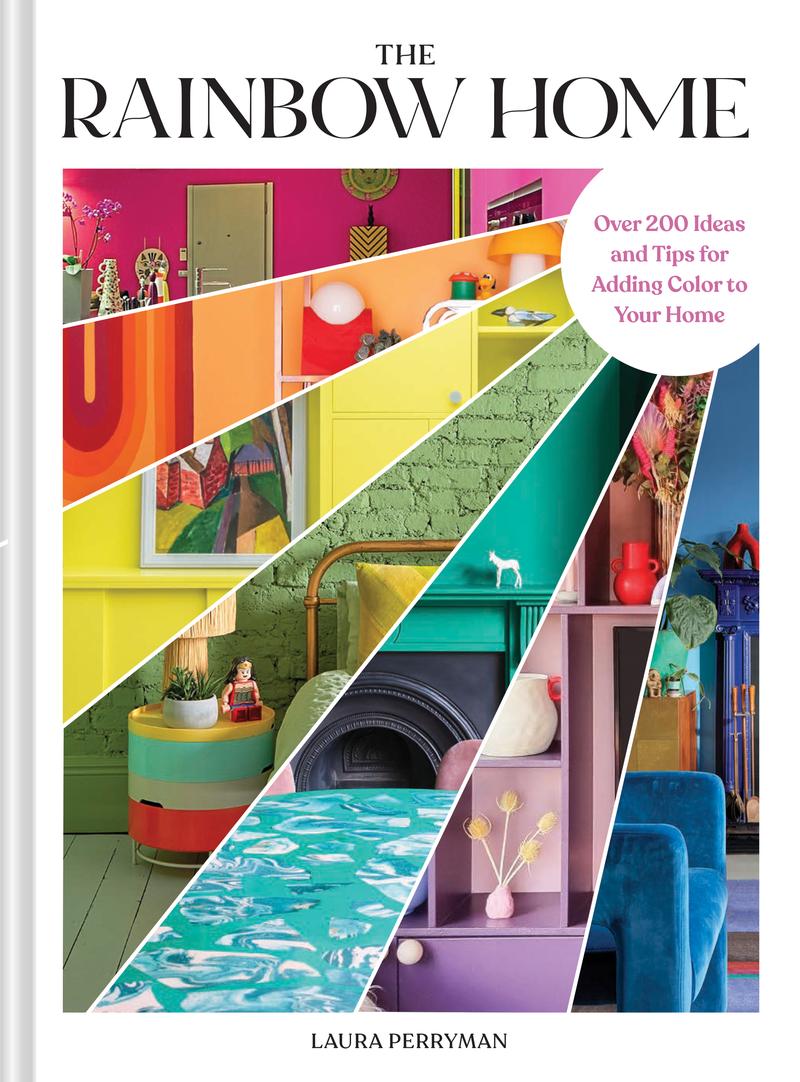
My next guest thinks we can use color more strategically. Laura Perryman is a color designer, and her new book is called The Rainbow Home: Over 200 Ideas and Tips for Adding Color to Your Home. Laura is with me now from the UK to take your calls on "What the Hack?" color edition. Hi, Laura.
Laura Perryman: Hey, thanks so much for having me.
Alison Stewart: What does the evidence say to us about the effect color can have on our mood and our overall well-being?
Laura Perryman: Color is such an incredible tool, and it's been studied for centuries through color psychology, but also neuroscience as well. We're starting to learn lots and lots more about the deep impact of certain colors, even on our behavior, our mood, and even our physical being. We can have colors if they're placed right in the home that even lower our heart rates, relaxes, or even peppers up and energizes. That's what's really exciting about color, is that we can use it really well in our homes.
Alison Stewart: Why are we attracted to certain colors over others?
Laura Perryman: I think we are hardwired as human beings to have certain preconceptions about color. Obviously, green is an incredibly important color area to us because we see it as a very positive color. Greenness in nature is a very important color because it means safety. It means we can go to a green space and feel relaxed. We often take those common connotations along with us in our daily lives. Memory also plays a really, really important part.
How you have had an association with a color through your past life or your childhood, the color of that gorgeous color of the cardigan that your grandmother wore, you take those through into your adult life as well. You have these subconscious connections with color that you may or may not always realize until you take a little bit of time to find them out.
Alison Stewart: Listeners, we want to get you in on this conversation. How do you like to decorate or paint your home with color? Are you trying to decide on a new wall color and you need some advice? Call or text us now, 212-433-9692, 212-433-WNYC. Are you someone who likes a lot of color in your home? Do you wish you were bolder with colors but are unsure which colors to pick or where to start? We can help you. 212-433-9692, 212-433-WNYC. Now, if you live in an apartment building that is struggling to find a color scheme for your common area, we want to hear that story as well. 212-433-9692, 212-433-WNYC.
My guest is Laura Perryman. She's a color designer. We're discussing her new book, The Rainbow Home: Over 200 Ideas and Tips for Adding Color to Your Home. It's part of our "What the Hack?" series. Many of our listeners live in smaller spaces and apartments. Some people live outside the city, folks who are in New Jersey and in Connecticut. Let's talk about the apartment. How should color choice change depending on the size of your space?
Laura Perryman: Yes. Different types of color or levels of color can create different feelings or even moods, or even change the perception of your hallway or living room, for instance. Lighter tones always make spaces feel much larger, whereas if you choose a much more rich, dark, deep, sumptuous color, you're going to make it feel like it's a cocoon, like a smaller environment. Also, the way that your apartment or your windows, which way they face, like south facing, north facing, east facing, they can make differences in terms of the quality of light that comes through the apartment.
One of my biggest tips is always to think about where does the light start at the beginning of the day and where does it end, and what moods you would like to try and connect with in that time.
Alison Stewart: What is a good selection for a place where there's low light?
Laura Perryman: Any warm base colors are great when you don't have much light because it just brings in a much more warmer, richer, hotter feeling into the space. That's a really great way to start if you don't have a lot of light, for instance. If you have lots of light and you have very bright spaces, you can use darker tones, you can use more contrasting colors, and you can use cooler colors because they will take the light, and you can create a really interesting atmosphere. Blues in light spaces are brilliant. If you've got a darker space, go for a much more nurturing orange, or like a terracotta color, for instance.
Alison Stewart: When you're deciding on a new color for your wall or your front door, it's hard. We all put squashes all over the place. What are some questions you recommend we ask ourselves when trying to find the right color?
Laura Perryman: I think it's pairing the colors with the personality of the space. This might feel a little bit odd at first, but think about-- take, for instance, your front door. What perception do you want? What's your inner personality? How do you want to express that to the world? How do you want people to feel when they knock on your door? Do you want to give them a sense of joy? Do you want to give them a sense of reassurance? You can start to pair colors along with some of those moods because that's one way of bringing color and your personality together, for instance.
Alison Stewart: This is interesting. This text follows up a little bit on that. It says, "My house is painted with yellow walls from years ago when it was popular. I've been dying to change it, but now yellow is popular again. Do I stay fashionable or change my walls to something more neutral?" There's two parts to that. There is the value of the home, and then there's what you like.
Laura Perryman: Yes, definitely. Think about how the color is already resonating in the space. Does it feel good? Does it feel good to you? This is really, really key for how we bring this rainbow feel into our home. This is what the book is based on. It's about you finding your individual preferences and finding how you tune up different colors to how you want the mood of the space to be. Yellows are perfect for creating optimism, thy're energizing. They're very warming, and they're great for social interactions. If this is a living space, if this is a place where you entertain lots of your family members and people that you love in your life, yellow is perfect for that.
Honestly, if you're trying to sleep and you want to have a less stimulating space, other colors are far more better suited. It's about finding out these activities in your home, aligning those to color preferences.
Alison Stewart: Let's take a call. This is Tabby calling us from Brooklyn. Hey, Tabby, thanks for making the time to call All Of It. You're on the air.
Tabby: Hi. This is exciting because I am torn.
Alison Stewart: Torn, yes.
Tabby: Should I jump right in with my question?
Alison Stewart: Go right for it.
Tabby: I'm in an apartment. It's an open concept. Kitchen meets living space. Initially, I had a bright green on the wall because when we move in, I'm like, "I would like to walk in and feel happy," but now I'm into dark colors. I'm looking at dark brown, dark burgundy. I'm wondering, what does that say about where I am now? Also, how does it tie in? I am concerned and a bit scared, to be honest, about how to do all the walls. I have one, two, three. Three walls. Then the kitchen. What do I do with then the kitchen? Although I have no place in the kitchen to paint because it's all covered.
Alison Stewart: That flow from kitchen to living room.
Laura Perryman: Yes, and there's so many different things that you can think about also within the space. Do you want to make your kitchen feel separated, or do you want it to create a feeling of integration? Color can be something that can live on different parts of the room as you go in. For instance, you can paint an entire wall, but then you could take that color into a trim color or an accent color, for instance, into another part of the space. This will create this visual consistency. I hear you about browns. They seem to become very popular at the moment.
Obviously, pantone color of the year was a brown, and we're feeling very like we need to be nurtured as well within spaces. We're leaning a little bit into these warm, nutty, brown, creamy areas, because they just have that sense of quality in them that we find reassuring. I would definitely encourage you to lean into this burgundy area that you're thinking about as well, because purply colors, even if they're a bit brownie, purply, can actually be really invigorating and really energizing as well, and good for your mental capacity. I would definitely ear you on to choosing something that's got a little bit of color in the brownness. It's not so straightforward and too warm in some ways.
Alison Stewart: Let's talk to Claire, who's calling in from Manhattan. Hey, Claire, you're on the air.
Claire: Hi. My question is very specific, and I'm not sure if you can help, but I live in an apartment that has a double door in between the front and the back. It's a dark area. There's no window right next to it unless I open the door to the bedroom. I'm trying to figure out a color scheme. I don't know if you know the Frida Kahlo Museum in Mexico, that has this very vibrant, almost cobalt blue, bright green, and then a strip of red.
I've looked at some colors, and it's very hard for me to figure out how to match in terms of light. I went and picked up some Ben Moore swatches, but how do you know from looking at those pieces of cardboard? I guess you have to buy samples. Do you have any recommendations for how I can complete this project successfully?
Alison Stewart: The idea is helping her figure out what paints to get and what colors to get.
Laura Perryman: Yes, I definitely think it's worth if you've got some really nice references for the blue and the reds and those key colors that you can see within the space that you're inspired by. I know exactly the space that you're talking about. It's absolutely beautiful. I would just encourage you to look around, not just that one color that you think it is, but take two or three steps either side. A little bit lighter and a little bit darker. If you can, in tester pots or even just when you go into the paint store, you can see the different tester strips. You can take a strip that's slightly lighter and take a strip that's slightly darker, and then hold them up in the space against the level of light that you've got.
Look at how well they bounce off light. I think when we have dark spaces, we think that we should have light colors all the time. Actually, if we want a sense of richness and we want to create a really powerful combination and a really powerful mood, sometimes something a little bit darker actually works really well. If you have some options around that key core color, it can really help you make a decision.
Alison Stewart: You are listening to our "What the Hack?" color edition. We're talking to Laura Perryman. Her book is called The Rainbow Home: Over 200 Ideas and Tips for Adding Color to Your Home. Listeners, if you have a question or you'd like to ask Laura a question, our number is 212-433-9692, 212-433-WNYC. We'll have more after a quick break. This is All Of It.
[music]
Alison Stewart: You are listening to All Of It on WNYC. I'm Alison Stewart. My guest is Laura Perryman. She's a color designer, and we're discussing her new book, The Rainbow Home: Over 200 Ideas and Tips for Adding Color to Your Home. We're taking your calls. How do you like to decorate or paint your home with color? Are you trying to decide on a new color and you need advice? 212-433-9692, 212-433-WNYC. I wanted to ask about a piece of advice. In your book, Laura, you write about color walks. First of all, what is a color walk, and why can it be helpful?
Laura Perryman: A color walk is basically a big inspiration trip for color. It's a way of collecting color from our natural environment, places which we love, which we maybe walk every day. It's a way of taking a more personal approach to color that isn't necessarily driven from Instagram or driven from magazines. It's been very in tune with our own brains, our own likes, our own needs, and basically going for a walk somewhere that you really love, like around a lake or down into the bottom of your garden or in your neighborhood, looking for these cues to color as you go along and recording them, taking photographs, taking notes and bringing that back home so that you can see what you really love.
Alison Stewart: It was really interesting. A part of your book-- I love when I could read stuff and I learn new things. You had a whole section giving definitions of certain words, like, what's the difference between a hue versus a tone?
Laura Perryman: Yes, for sure. Color science is a really important part of understanding more about color. In the book, really wanted to get that key information across to everyone. A tone is more of a tint of color. It's something that takes on the darkness or blackness in a color. We can have a dark, slightly darker, or muted purple, or a slightly lighter or muted purple. We add more whiteness to it, and that's called a tint. A tone has got the darker colors in it. These help us navigate what we want in terms of a color. We might say we want a darker tone or a lighter tint. That just helps us find that color a bit easier, I think.
Alison Stewart: What about the chromatic and chromatic tension? What do they mean?
Laura Perryman: Yes. The chromatic tension relates really to combinations. A lot of the book is dedicated to once we found these amazing colors that we love, how we put them into practice, because I think a lot of people might love a certain shade, but they don't really know how to put it together in an actual scheme. The chromatic tension is about understanding the relationships between certain colors. The color wheel becomes a really important tool. Within this, we can create really beautiful, bold clash or bold impactful color combinations by playing with the chromatic tension. That's colors that exist at either side or opposite sides of the color wheel. This chromatic tension is really important for creating quite powerful and bold combinations, for instance.
Alison Stewart: Let's take another call. This is Scott, who's calling in from Commack, Long Island. Hi, Scott. Thanks for taking the time to call All Of It. You are on the air.
Scott: Hey, how are you today?
Alison Stewart: Doing well.
Scott: Good, good. I work at a paint store, Aboff's Paint in Commack, Long Island, and I was hearing a caller talking about color samples. Color samples are really important, but they're always important to test them out in your lighting in your home. The lighting at a paint store is not quite like your lighting at home. Colors change when they move from room to room. Always test them on white, like a white background. Don't be painting over some pink or something like that. Don't ask the guy behind the counter to match a color from your phone.
Alison Stewart: [laughs] Good advice. Thank you so much for calling. This is a question from Christina in Redding, Connecticut. She writes, "We live in a reproduction colonial home with lots of exposed beams and dark brown wooden trim. Is it still a faux pas to paint trim? We are considering flooding our sitting room with a dark green, but are nervous about it all going in." What are your thoughts, Laura?
Laura Perryman: Yes, I think definitely paint your trim. I think this creates this feeling of color-drenching or full-on monochromatic color. This is really important for creating spaces that feel very connected and cocooning. I would definitely say yes, go for it. I think Bob's question before and statement is very key to this. It's about light levels. Again, testing out the color in the space, observing it throughout the day, and seeing how you feel through the light levels in your home before making that big commitment, I would say.
Alison Stewart: Let's talk to Marilyn, who's calling in from Manhattan. Hi, Marilyn. Thanks so much for calling in.
Marilyn: Hi. I live in an Upper West Side pre-war building. I've been here since I had it as rent control. Now it's a co-op. The rooms are a little narrow, big enough. I have two bedrooms, a living room, and I have an extensive collection of original prints. I have a Frank Stella print. I have an Oldenburg print. Those have color. I have a lot of black and white. My walls have always been what they call antique white, which is a, I'd say, the color of latte with wider trim. People keep saying, "Oh, you should do color." I'm, of course, nervous about doing color because I think it may not show up the artwork well. That's my question.
Alison Stewart: A color that is good for artwork. What do you think?
Laura Perryman: Yes, it sounds beautiful. I'd love to see your collection of prints and artworks. I think this makes a really great point because we can be inspired by the objects that we have collected and surround ourselves with. I would love to see you take out one or two key colors from those amazing prints and almost reproduce them on the wall. You could have a key color wall, for instance, and make a very striking display specifically with a very strong color, like a bright vibrant pink or a vibrant yellow or coral color. Anything that has a warm base is a lot more easy for our eyes. I think if we've got lots of things going on, warm colors can help really unite a space. I would go for it with something warm and strong.
Alison Stewart: Faith has a question. Faith is calling in from Manhattan. Hi, Faith, what's your question?
Faith: Hey. I just moved into a very light apartment. The living room faces south, and I have a skylight in my kitchen. They're a pass-through between the two roads. Everything is painted white, this very bright white. We'd like to make the living room just a little different. Also, the paint job is not very good. Just wondered for suggestions. Our furniture is a lot of-- we have a lot of antiques and we have paintings that are going to go on the wall, which are-- Also, a lot of very older antique as well.
Alison Stewart: All right, we've got all white, new place, lots of antiques. What are your suggestions?
Laura Perryman: Yes, I think this is also to do with the quality of your light as well. You talk about big south-facing level of light, lots of color, light flooding. I think you can really take on quite a bold color choice. You could take on quite a deep, bold color choice as well, such as a really saturated blue or a saturated orange, or even a purple. You could create a key wall again in a similar way. Continue that key color through trim or even accessories. You really tie in that key color choice.
Alison Stewart: In your book, you have all different suggestions for all different rooms in your home. I want to talk about the home office because more people now are working from their home or working from their home part-time. How can the color that you choose for your office, whatever you decide to call your office, how can it affect your productivity? Do you have any suggestions?
Laura Perryman: Yes, this is a really interesting area. I think, as we go forward with hybrid working models are changing lifestyles. Colors that we can spend a long time with and that encourage concentration are very key here. That can be light or muted greens. Also, blues, very light blues, more muted blues are perfect for ongoing concentration. I think this is about how you personally prefer to work as well, and what space you want to create when you're working. However, things like oranges can be very energizing. If you need that creative impulse, you need that creative support for your brain, you need that injection of energy. An orange shade or a muted coral shades can be absolutely perfect backdrop for working space.
Alison Stewart: This is a text that says, "Can you address using dark colors in a small space? There's a myth that dark colors make a space feel smaller, but I believe it's really about you using dark colors contrasting in combination with light colors in order to make the space look larger. Am I on the right track?"
Laura Perryman: Yes, definitely. I think there is a massive myth about this area as well, with darkness. I think we want to create mood, dark colors, more chromatic. Dark colors help us set moods much more. Again, one way to tackle this feeling of having a completely dark environment is by putting a lighter color or a slightly lighter shade at the end or in one of the key feature walls, because then it draws your eye around the space. The rest of the space can be quite dark and very chromatic and vibrant and passionate looking. Then if you have this lighter element, either as a trim or as a key feature wall, you draw your eye around, and actually it completely changes the way that you perceive the space.
Alison Stewart: Let's talk to Jules real quick. Jules, tell us your story.
Jules: Hey. Last summer, I painted my little balcony banister a very particular green to match Monet's water lily bridge in Giverny. I might have manifested because I'd never seen it. I grew up loving Monet, and I'm an artist, and in about five days, I get to see it in real life. It brings me a lot of joy to look out and see that little nod. It'll bring me a lot of joy to see it in France in a couple of days.
Alison Stewart: Safe travels to you, Jules. Thanks for calling in. In our last second, Laura, let's say I have a favorite color. Should I paint everything my favorite color?
Laura Perryman: I think you should look at what things are already your favorite color in your home and add specific accents of it. I would also encourage you to look at the color wheel and choose a color from a different part of the color wheel which complements your favorite color. There you will have so much more joy and inspiration.
Alison Stewart: The name of the book is The Rainbow Home: Over 200 Ideas and Tips for Adding Color to Your Home. It is our "What the Hack?" the color edition. Thanks to Laura Perryman for joining us. Thanks, Laura.
Laura Perryman: Thank you so much for having me. It was a pleasure.
Alison Stewart: Coming up next on All Of It, Valerie June joins us live in WNYC Studio 5, perform from her latest album Owls, Omens and Oracles. That's coming up right after the news.